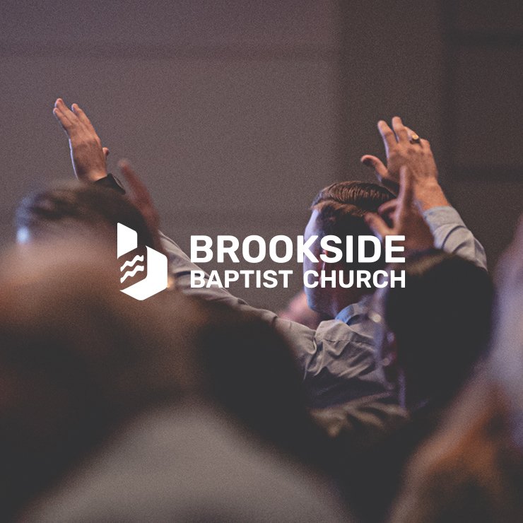
T he client, Brookside, was entering into a new season, and naturally would need to renew their visual identity. Brookside is a Ottawa’s local Christian church.
02. The Solution
In this project, we introduced an innovative approach to refresh and elevate the brand’s visual identity. We developed the new logo from scratch while navigating a set of strategic creative challenges.
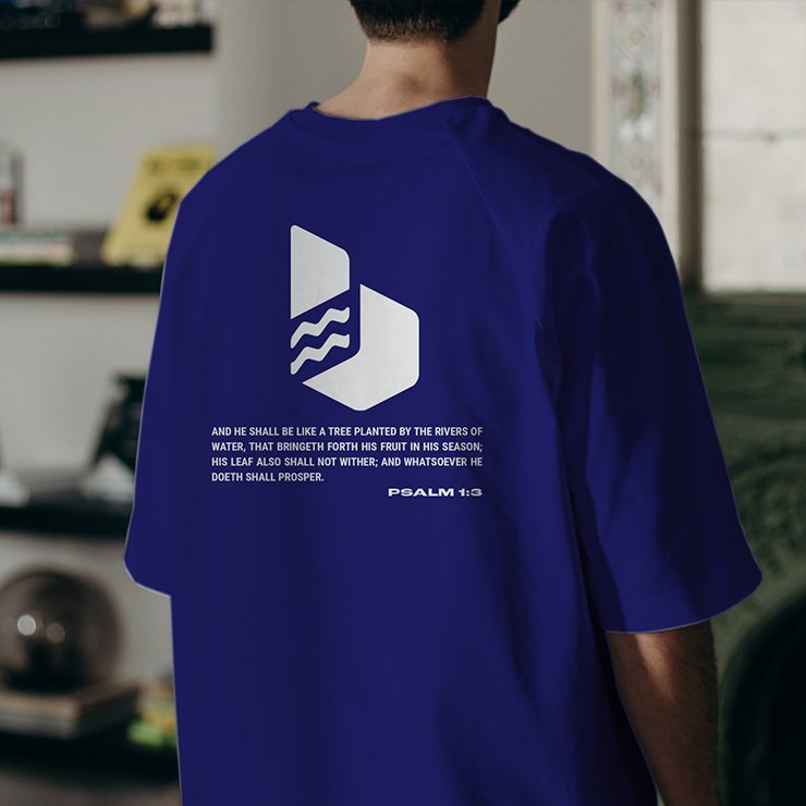
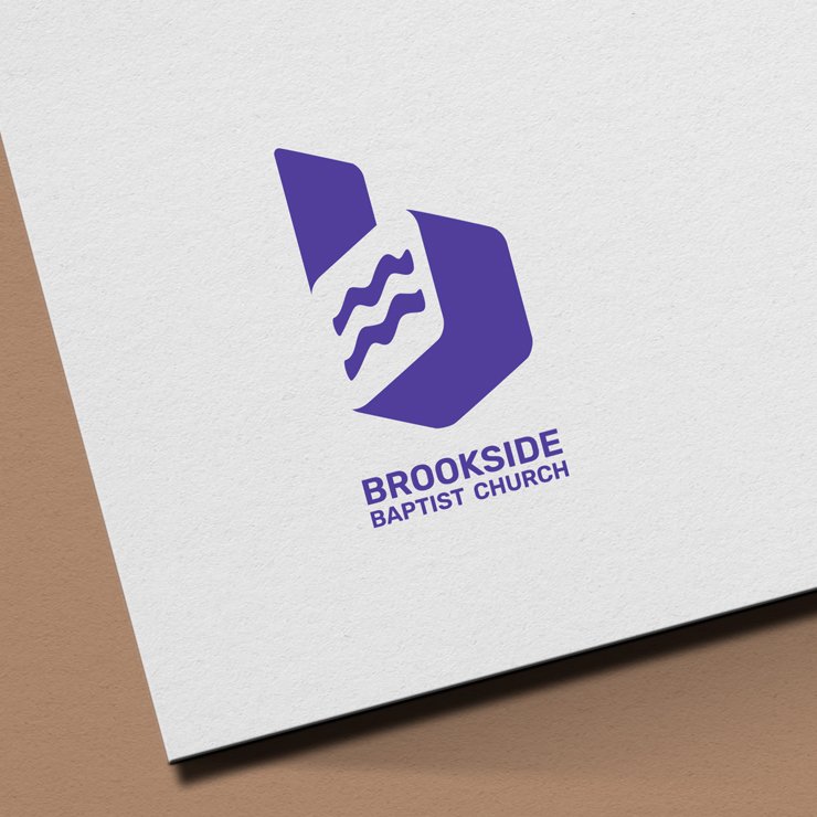
One of the key requests was to incorporate the letter “B” in an abstract and contemporary way. To achieve this, we integrated flowing wave elements that symbolize a river—representing movement, journey, and abundance of life.
The client also requested the use of a bold, striking color to bring greater energy and vitality to the identity.
Finally, the logo was designed with flexibility at its core, allowing it to be easily adapted across different departments of the church.
Thanks so much for all your work on this project. Your team did an awesome job! I really like how the logo has come together, it looks clean, professional, and welcoming!
– GREG – BROOKSIDE PASTOR
03. The Result
The final logo successfully reflect the client’s brand, with a strong icon and a vibrant palette that reinforces the brand’s presence and emotional impact.
The modular approach supports the creation of cohesive sub-brands while maintaining a strong and unified visual language.